Economist-Style Highlights: AI Investment
Background
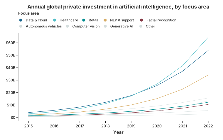
A recurring request is to reproduce the visual language of The Economist: a small number of focus series drawn in strong colours and a heavier stroke, while every other series recedes into thin grey context. The original report (issue about legend and label customisation) also needed two things Charton did not offer at the time:
- the legend had to be renamed and positioned at the top;
- the y axis had to read
$20B, not2.0000E10or20000000000.
This case study rebuilds that chart with synthetic data, so it runs without any external file.
Strategy
The chart is assembled in three moves:
- Split the data into the areas that should stand out and the areas that provide context.
- Layer the two charts with
.and(). The context layer uses a thinner stroke, so the two layers genuinely differ. - Format the labels.
LabelFormathandles both the axis ($0…$60B) and the legend entries (long data names become short, readable ones).
Implementation
//! Economist-style chart: highlighted focus areas over greyed-out context.
//!
//! This mirrors the layering strategy from the issue: one chart for the series
//! that should stand out, one for the rest, combined with `.and()`. The data is
//! synthetic, so the example runs without any external file.
//!
//! The palette and the legend position describe the whole chart, so they are
//! applied once to the combined result instead of to either layer.
//!
//! Run with: `cargo run --example economist_chart`

use charton::prelude::*;

/// Focus areas that get their own colour and a legend entry.
const HIGHLIGHTED: [(&str, f64, f64); 5] = [
    ("Data management, processing, cloud", 4.0e9, 1.45),
    ("Medical and healthcare", 3.0e9, 1.55),
    ("Retail", 1.5e9, 1.35),
    ("Natural language, customer support", 2.0e9, 1.50),
    ("Facial recognition", 1.0e9, 1.40),
];

/// Every other focus area, drawn as grey context.
const CONTEXT: [(&str, f64, f64); 4] = [
    ("Autonomous vehicles", 2.5e9, 1.30),
    ("Computer vision", 1.2e9, 1.25),
    ("Generative AI", 0.5e9, 1.60),
    ("Other", 0.8e9, 1.20),
];

/// Deterministic synthetic series: `base * growth^year`, 2015..=2022.
fn build(entities: &[(&str, f64, f64)]) -> Result<Dataset, Box<dyn std::error::Error>> {
    let mut year = Vec::new();
    let mut entity = Vec::new();
    let mut investment = Vec::new();

    for (name, base, growth) in entities {
        for offset in 0..8 {
            year.push((2015 + offset).to_string());
            entity.push((*name).to_string());
            investment.push(base * growth.powi(offset));
        }
    }

    Ok(Dataset::new()
        .with_column("Year", year)?
        .with_column("Entity", entity)?
        .with_column("investment", investment)?)
}

fn main() -> Result<(), Box<dyn std::error::Error>> {
    let highlight_ds = build(&HIGHLIGHTED)?;
    let context_ds = build(&CONTEXT)?;

    // The palette is indexed by the colour domain, and the merged domain lists
    // the first layer's categories first. So it is built as "one colour per
    // focus area, then grey for every context area".
    let mut palette: Vec<SingleColor> = ["#17648d", "#51bec7", "#008c8f", "#d6ab63", "#843844"]
        .iter()
        .map(|hex| (*hex).into())
        .collect();
    palette.extend(std::iter::repeat_n(
        SingleColor::from("#d4dddd"),
        CONTEXT.len(),
    ));

    // 20_000_000_000 -> "$20B".
    let money = LabelFormat::new()
        .with_prefix("$")
        .with_compact_notation()
        .with_precision(0);

    let short_names = LabelFormat::new().with_text_formatter(|label| {
        match label {
            "Data management, processing, cloud" => "Data & cloud",
            "Medical and healthcare" => "Healthcare",
            "Natural language, customer support" => "NLP & support",
            other => other,
        }
        .to_string()
    });

    let highlight_chart = Chart::build(highlight_ds)?
        .mark_line()?
        .configure_line(|line| line.with_stroke_width(1.25))
        .encode((alt::x("Year"), alt::y("investment"), alt::color("Entity")))?
        .with_title("Annual global private investment in artificial intelligence, by focus area")
        .with_y_label("")
        .with_color_label("Focus area")
        .with_y_label_format(money)
        .with_legend_label_format(short_names);

    let base_chart = Chart::build(context_ds)?
        .mark_line()?
        .configure_line(|line| line.with_stroke_width(0.75))
        .encode((alt::x("Year"), alt::y("investment"), alt::color("Entity")))?;

    highlight_chart
        .and(base_chart)
        .with_size(760, 480)
        // Palette and legend position describe the whole chart, not a single
        // layer, so they are set once after the layers have been combined.
        .configure_theme(|theme| {
            theme
                .with_palette(ColorPalette::Custom(palette))
                .with_legend_position(LegendPosition::Top)
        })
        .save("docs/src/images/economist_chart.svg")?;

    Ok(())
}
What to notice
Formatting is attached to the chart, not the theme
#![allow(unused)]
fn main() {
let money = LabelFormat::new()
    .with_prefix("$")
    .with_compact_notation()   // 20_000_000_000 -> 20B
    .with_precision(0);
}
with_y_label_format applies it to the axis, with_legend_label_format to the
legend entries and the colour bar. A closure can replace either one entirely:
#![allow(unused)]
fn main() {
LabelFormat::new().with_text_formatter(|label| match label {
    "Medical and healthcare" => "Healthcare",
    other => other,
})
}
The same formatter is used when the layout engine measures the labels, so the axis reserves exactly the width the formatted text occupies.
Renaming a legend is not renaming a field
with_color_label("Focus area") changes only the legend title. The data column
stays Entity, so colours and grouping are unaffected. This is why the title
lives on the aesthetic mapping separately from the field name.
Theme settings belong to the whole chart
with_palette and with_legend_position describe the figure as a whole, so
they are applied once, after .and() has combined the layers:
#![allow(unused)]
fn main() {
highlight_chart
    .and(base_chart)
    .with_size(760, 480)
    .configure_theme(|theme| {
        theme
            .with_palette(ColorPalette::Custom(palette))
            .with_legend_position(LegendPosition::Top)
    })
}
Setting them on a single layer would be misleading: when two charts are combined, only the left one's theme survives, so a setting written on the right layer is silently dropped. The merged colour domain still lists the first layer's categories first, so the palette is built as one colour per focus area, then grey for every context area:
#![allow(unused)]
fn main() {
let mut palette: Vec<SingleColor> = ["#17648d", "#51bec7", "#008c8f", "#d6ab63", "#843844"]
    .iter()
    .map(|hex| (*hex).into())
    .collect();
palette.extend(std::iter::repeat_n(SingleColor::from("#d4dddd"), CONTEXT.len()));
}
The context layer only sets its thinner stroke width; the palette and the legend are supplied by the combined chart and cover every category.
Using the real dataset
The synthetic series above follow the same shape as the original CSV. With Polars, the split is a one-line mask instead of two constants:
#![allow(unused)]
fn main() {
let ds = load_polars_df!(df.filter(&mask)?)?;              // focus areas
let ds_context = load_polars_df!(df.filter(&!mask)?)?;     // everything else
}
Both datasets keep the same column names, so the chart code is unchanged.