Line Charts
A line connects the rows of a group in x-order. One group per colour, so a
multi-series line is just color.
Multiple series
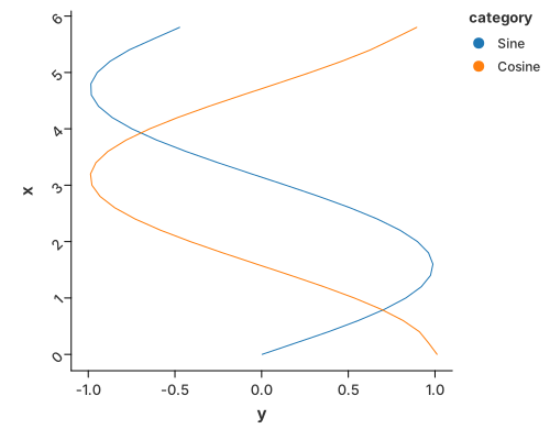
Two curves on one axis. configure_line also offers smoothing (LOESS) when the
data is noisy.
use charton::prelude::*;

fn main() -> Result<(), Box<dyn std::error::Error>> {
    // Create data for multiple groups (e.g., sine and cosine curves)
    let x_values: Vec<f64> = (0..30).map(|i| i as f64 * 0.2).collect();
    let y_sine: Vec<f64> = x_values.iter().map(|&x| x.sin()).collect();
    let y_cosine: Vec<f64> = x_values.iter().map(|&x| x.cos()).collect();

    // Combine data into a single DataFrame with categories
    let x = x_values.repeat(2); // Repeat x values for both groups
    let y = [y_sine.clone(), y_cosine.clone()].concat();
    let category = [vec!["Sine"; 30], vec!["Cosine"; 30]].concat();

    // Create a line chart with multiple groups
    chart!(x, y, category)?
        .mark_line()?
        .configure_line(|l| l.with_loess(true).with_loess_bandwidth(0.2))
        .encode((
            alt::x("x"),
            alt::y("y"),
            alt::color("category"), // This creates separate lines for each category
        ))?
        .configure_theme(|t| t.with_x_tick_label_angle(-45.0))
        .coord_flip()
        .save("docs/src/images/line.svg")?;

    Ok(())
}
Gaps
A missing x or y breaks the line instead of drawing across it, so an outage
in a time series reads as a gap in the curve. See
Missing Values & Gaps.
Cumulative frequency
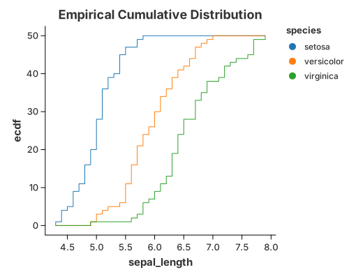
A running total as a line — the cumulative shape of a distribution without a histogram.
use charton::prelude::*;
use std::error::Error;

fn main() -> Result<(), Box<dyn Error>> {
    let ds = load_dataset("iris")?;
    // Create a chart with window transform
    chart!(ds)?
        .transform_window(
            WindowTransform::new(WindowFieldDef::new(
                "sepal_length",
                WindowOnlyOp::CumeDist,
                "ecdf", // This will be the output column name
            ))
            .with_groupbys(["species"])
            .with_normalize(false),
        )?
        .mark_line()?
        .configure_line(|l| l.with_interpolation("step")) // Add step interpolation
        .encode((
            alt::x("sepal_length"),
            alt::y("ecdf"),
            alt::color("species"),
        ))?
        .with_title("Empirical Cumulative Distribution")
        .save("docs/src/images/cumulative_frequency.svg")?;

    Ok(())
}
Multi-series with error bars
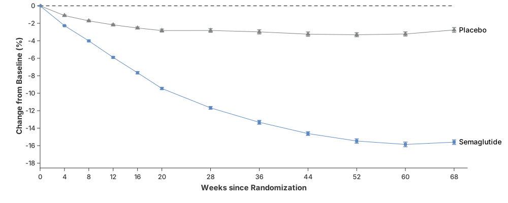
Lines plus mark_errorbar and points, layered with .and(…) — the shape of a
published trial figure.
use charton::prelude::*;
use std::error::Error;

// The data is obtained from paper "Once-Weekly Semaglutide in Adults with Overweight or Obesity"
// using [webplotdigitizer](https://automeris.io/).
fn main() -> Result<(), Box<dyn Error>> {
    // Placebo group data (control group)
    let ds_placebo = vec![
        // X-axis: time since randomization (weeks)
        (
            "Weeks since Randomization",
            [0, 4, 8, 12, 16, 20, 28, 36, 44, 52, 60, 68].into_column(),
        ),
        // Y-axis: mean percentage change in body weight from baseline. Negative values indicate weight loss
        (
            "Change from Baseline (%)",
            [
                0.00, -1.11, -1.72, -2.18, -2.54, -2.83, -2.82, -2.98, -3.24, -3.31, -3.22, -2.76,
            ]
            .into_column(),
        ),
        // Lower bound of the confidence interval (typically 95% CI)
        (
            "lower",
            [
                -0.042, -1.18, -1.81, -2.28, -2.66, -3.00, -3.03, -3.22, -3.49, -3.54, -3.46, -3.03,
            ]
            .into_column(),
        ),
        // Upper bound of the confidence interval (95% CI)
        (
            "upper",
            [
                0.042, -1.04, -1.63, -2.08, -2.42, -2.66, -2.61, -2.74, -2.99, -3.08, -2.98, -2.49,
            ]
            .into_column(),
        ),
    ]
    .to_dataset()?;

    // Semaglutide group data (treatment group)
    let ds_semaglutide = vec![
        (
            "Weeks since Randomization",
            [0, 4, 8, 12, 16, 20, 28, 36, 44, 52, 60, 68].into_column(),
        ),
        (
            "Change from Baseline (%)",
            [
                0.00, -2.27, -4.01, -5.9, -7.66, -9.46, -11.68, -13.33, -14.62, -15.47, -15.86,
                -15.6,
            ]
            .into_column(),
        ),
        (
            "lower",
            [
                -0.041, -2.3, -4.1, -5.98, -7.79, -9.58, -11.84, -13.55, -14.83, -15.72, -16.13,
                -15.86,
            ]
            .into_column(),
        ),
        (
            "upper",
            [
                0.041, -2.24, -3.92, -5.82, -7.53, -9.34, -11.52, -13.11, -14.41, -15.22, -15.59,
                -15.34,
            ]
            .into_column(),
        ),
    ]
    .to_dataset()?;

    // Text labels (placed at the right side of the plot)
    let ds_text = vec![
        ("x", [68.8, 68.8].into_column()),
        ("y", [-3.05, -15.86].into_column()),
        ("group", ["Placebo", "Semaglutide"].into_column()),
    ]
    .to_dataset()?;

    // Reference line (y = 0 → no weight change)
    let ds_reference = vec![
        ("x", [0.0, 76.0].into_column()),
        ("y", [0.0, 0.0].into_column()),
    ]
    .to_dataset()?;

    // Layer 1: Placebo points (markers at each time point)
    let placebo_point = Chart::build(&ds_placebo)?
        .mark_point()?
        .configure_point(|p| {
            p.with_color("#818284")
                .with_shape("triangle")
                .with_size(5.0)
        })
        .encode((
            alt::x("Weeks since Randomization"),
            alt::y("Change from Baseline (%)"),
        ))?;

    // Layer 2: Placebo line (connects the points)
    let placebo_line = Chart::build(&ds_placebo)?
        .mark_line()?
        .configure_line(|l| l.with_color("#818284"))
        .encode((
            alt::x("Weeks since Randomization"),
            alt::y("Change from Baseline (%)"),
        ))?;

    // Layer 3: Placebo error bars (confidence intervals)
    let placebo_errorbar = Chart::build(&ds_placebo)?
        .mark_errorbar()?
        .configure_errorbar(|e| {
            e.with_color("#818284")
                .with_cap_length(4.0)
                .with_stroke_width(1.5)
        })
        .encode((
            alt::x("Weeks since Randomization"),
            alt::y("lower"),
            alt::y2("upper"),
        ))?;

    // Layer 4: Placebo text label
    let placebo_text = Chart::build(ds_text.head(1))?
        .mark_text()?
        .configure_text(|t| t.with_anchor("left").with_size(14.0))
        .encode((alt::x("x"), alt::y("y"), alt::text("group")))?;

    // Layer 5: Semaglutide points
    let semaglutide_point = Chart::build(&ds_semaglutide)?
        .mark_point()?
        .configure_point(|p| p.with_color("#5b88c3").with_shape("square").with_size(3.0))
        .encode((
            alt::x("Weeks since Randomization"),
            alt::y("Change from Baseline (%)"),
        ))?;

    // Layer 6: Semaglutide line
    let semaglutide_line = Chart::build(&ds_semaglutide)?
        .mark_line()?
        .configure_line(|l| l.with_color("#5b88c3"))
        .encode((
            alt::x("Weeks since Randomization"),
            alt::y("Change from Baseline (%)"),
        ))?;

    // Layer 7: Semaglutide error bars
    let semaglutide_errorbar = Chart::build(&ds_semaglutide)?
        .mark_errorbar()?
        .configure_errorbar(|e| {
            e.with_color("#5b88c3")
                .with_cap_length(4.0)
                .with_stroke_width(1.5)
        })
        .encode((
            alt::x("Weeks since Randomization"),
            alt::y("lower"),
            alt::y2("upper"),
        ))?;

    // Layer 8: Semaglutide text label
    let semaglutide_text = Chart::build(ds_text.tail(1))?
        .mark_text()?
        .configure_text(|t| t.with_anchor("left").with_size(14.0))
        .encode((alt::x("x"), alt::y("y"), alt::text("group")))?;

    // Layer 9: Reference line (baseline at 0%)
    let reference_line = Chart::build(&ds_reference)?
        .mark_line()?
        .configure_line(|l| l.with_dash([6.0, 6.0]))
        .encode((alt::x("x"), alt::y("y")))?;

    // Combine all layers (Grammar of Graphics composition)
    placebo_point
        .and(reference_line)
        .and(placebo_line)
        .and(placebo_errorbar)
        .and(placebo_text)
        .and(semaglutide_point)
        .and(semaglutide_line)
        .and(semaglutide_errorbar)
        .and(semaglutide_text)
        .with_x_expand(Expansion {
            mult: (0.00, 0.0),
            add: (0.0, 0.0),
        })
        .with_y_expand(Expansion {
            mult: (0.15, 0.01),
            add: (0.0, 0.0),
        })
        .with_size(1000, 400)
        .with_right_margin(0.08)
        .with_left_margin(0.02)
        .with_top_margin(0.02)
        .with_bottom_margin(0.03)
        .with_x_ticks([
            0.0, 4.0, 8.0, 12.0, 16.0, 20.0, 28.0, 36.0, 44.0, 52.0, 60.0, 68.0,
        ])
        .with_y_ticks([
            0.0, -2.0, -4.0, -6.0, -8.0, -10.0, -12.0, -14.0, -16.0, -18.0,
        ])
        .save("docs/src/images/weight_loss_curve.svg")?;

    Ok(())
}
Formatted axis labels (Economist style)
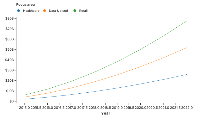
Axis labels are a scale concern: with_y_label_format(...) renders large values
as $20B instead of raw numbers.
//! Production-style label formatting.
//!
//! Reproduces the scenario from the issue: an "Economist-style" investment
//! chart where the y axis shows large values as `$20B` instead of raw numbers,
//! and the legend labels are tidied up.
//!
//! Run with: `cargo run --example label_format`

use charton::core::guide::LegendPosition;
use charton::prelude::*;

fn main() -> Result<(), Box<dyn std::error::Error>> {
    // Three focus areas, eight years, values in dollars.
    let years: Vec<f64> = (2015..2023).map(|year| year as f64).collect();
    let areas = [
        "Medical and healthcare",
        "Data management, processing, cloud",
        "Retail",
    ];

    let mut x = Vec::new();
    let mut investment = Vec::new();
    let mut area = Vec::new();
    for (index, name) in areas.iter().enumerate() {
        for year in &years {
            x.push(*year);
            // A made-up exponential-ish growth curve per area.
            let base = 2.0e9 * (index as f64 + 1.0);
            investment.push(base * (1.0 + (year - 2015.0) * 0.45).powf(1.8));
            area.push(*name);
        }
    }

    // Dollars, abbreviated, no decimals: 20_000_000_000 -> "$20B".
    let money = LabelFormat::new()
        .with_prefix("$")
        .with_compact_notation()
        .with_precision(0);

    // Legend labels: turn the long data names into short, readable ones.
    let short_names = LabelFormat::new().with_text_formatter(|label| match label {
        "Medical and healthcare" => "Healthcare".to_string(),
        "Data management, processing, cloud" => "Data & cloud".to_string(),
        other => other.to_string(),
    });

    chart!(x, investment, area)?
        .mark_line()?
        .encode((alt::x("x"), alt::y("investment"), alt::color("area")))?
        .with_size(760, 460)
        .with_x_label("Year")
        .with_y_label("")
        .with_color_label("Focus area")
        .with_y_label_format(money)
        .with_legend_label_format(short_names)
        .configure_theme(|theme| theme.with_legend_position(LegendPosition::Top))
        .save("docs/src/images/label_format.svg")?;

    Ok(())
}
Slope chart
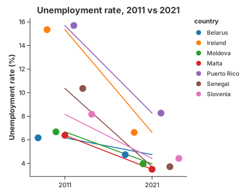
Change between two points in time: mark_line connects each group's two values
and mark_point marks them. Grouping the line is just color.
//! Slope chart — change between two points in time.
//!
//! A recipe: `mark_line` connects each country's two values across the two
//! periods and `mark_point` marks them. Grouping the line by colour is all it
//! takes; the two layers share the category and value scales.

use charton::prelude::*;
use std::error::Error;

fn main() -> Result<(), Box<dyn Error>> {
    let country = [
        "Belarus",
        "Ireland",
        "Moldova",
        "Malta",
        "Puerto Rico",
        "Senegal",
        "Slovenia",
    ];
    let y2011 = [6.17, 15.35, 6.68, 6.38, 15.70, 10.36, 8.17];
    let y2021 = [4.74, 6.63, 3.96, 3.50, 8.27, 3.72, 4.42];

    let countries_long: Vec<&str> = country.iter().chain(country.iter()).copied().collect();
    let periods: Vec<&str> = std::iter::repeat("2011")
        .take(7)
        .chain(std::iter::repeat("2021").take(7))
        .collect();
    let values: Vec<f64> = y2011.iter().chain(y2021.iter()).copied().collect();

    let ds = Dataset::new()
        .with_column("country", countries_long)?
        .with_column("period", periods)?
        .with_column("rate", values)?;

    let lines = chart!(&ds)?
        .mark_line()?
        .configure_line(|line| line.with_stroke_width(2.0))
        .encode((alt::x("period"), alt::y("rate"), alt::color("country")))?;

    let dots = chart!(&ds)?
        .mark_point()?
        .configure_point(|point| point.with_size(7.0))
        .encode((alt::x("period"), alt::y("rate"), alt::color("country")))?;

    lines
        .and(dots)
        .with_title("Unemployment rate, 2011 vs 2021")
        .with_x_label("")
        .with_y_label("Unemployment rate (%)")
        .save("docs/src/images/slope.svg")?;

    println!("Saved docs/src/images/slope.svg");
    Ok(())
}
Bump chart
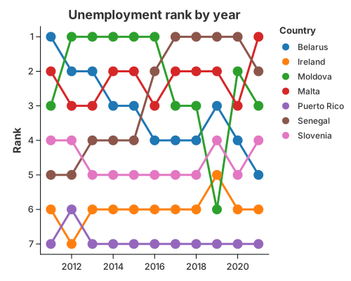
How a ranking moves over time. transform_window with WindowOnlyOp::Rank
ranks each group inside every period, and ordinary line/point layers draw the
trajectories. The y-axis is reversed with with_reverse(true) so rank 1 sits at
the top.
//! Bump chart — how a ranking changes over time.
//!
//! Ranks are a statistic, not a new geometry: `transform_window` with
//! `WindowOnlyOp::Rank` ranks each country inside every year, and ordinary
//! `mark_line`/`mark_point` layers draw the trajectories. The y-axis is
//! reversed (`with_reverse(true)`) so rank 1 sits at the top.

use charton::prelude::*;
use std::error::Error;

fn main() -> Result<(), Box<dyn Error>> {
    let unemployment = load_dataset("unemployment")?;
    let rank = || {
        WindowTransform::new(WindowFieldDef::new(
            "Unemployment rate (%)",
            WindowOnlyOp::Rank,
            "rank",
        ))
        .with_groupbys(["Year"])
    };

    let lines = chart!(&unemployment)?
        .transform_window(rank())?
        .mark_line()?
        .configure_line(|line| line.with_stroke_width(3.0))
        .encode((
            alt::x("Year"),
            alt::y("rank").with_reverse(true),
            alt::color("Country"),
        ))?;

    let dots = chart!(&unemployment)?
        .transform_window(rank())?
        .mark_point()?
        .configure_point(|point| point.with_size(7.0))
        .encode((
            alt::x("Year"),
            alt::y("rank").with_reverse(true),
            alt::color("Country"),
        ))?;

    lines
        .and(dots)
        .with_title("Unemployment rank by year")
        .with_x_label("")
        .with_y_label("Rank")
        .save("docs/src/images/bump.svg")?;

    println!("Saved docs/src/images/bump.svg");
    Ok(())
}