Risk Dashboard for an Equity Index
Background
A small risk view of a market series has two halves: the level over time and the distribution of returns. The first shows the path; the second shows the drift, the volatility and (if present) the tails that drive risk.
The series here is synthetic and deterministic — a small positive drift plus a periodic volatility component, generated without any random number generator — so the example is fully reproducible.
Index level over time
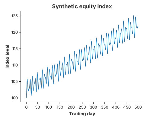
mark_line draws the index against the trading day. The up-drift is visible, but
so are the drawdowns and the changing volatility (the calm and turbulent
stretches come from the periodic term).
Distribution of daily returns
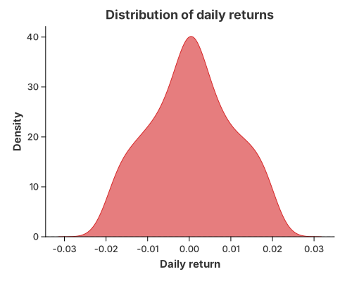
mark_density of the daily returns gives the risk picture: the curve is
off-centre (positive drift) and its width is the volatility. A real
return series would also show fat tails — more mass far from the centre than a
normal distribution predicts — which is what a risk model has to capture.
Implementation
//! Case study: a small "risk dashboard" for a synthetic equity index.
//!
//! Two figures:
//!
//! 1. the **index level** over time, and
//! 2. the **distribution of daily returns**, which is where tail risk shows up.
//!
//! The series is generated deterministically (no external RNG), so the example is
//! reproducible.

use charton::prelude::*;
use std::error::Error;

fn main() -> Result<(), Box<dyn Error>> {
    // Deterministic synthetic daily returns: a small positive drift plus a
    // periodic volatility component.
    let n = 500;
    let mut day = Vec::with_capacity(n);
    let mut price = Vec::with_capacity(n);
    let mut ret = Vec::with_capacity(n);

    let mut level = 100.0_f64;
    for i in 0..n {
        let t = i as f64;
        let r = 0.0004 + 0.02 * (t * 0.7).sin() * (t * 0.13).cos();
        level *= 1.0 + r;
        day.push(t);
        price.push(level);
        ret.push(r);
    }

    // 1. Index level over time.
    chart!(day, price)?
        .mark_line()?
        .configure_line(|line| line.with_color("#1f77b4").with_stroke_width(1.5))
        .encode((alt::x("day"), alt::y("price")))?
        .with_title("Synthetic equity index")
        .with_x_label("Trading day")
        .with_y_label("Index level")
        .save("docs/src/images/case_finance_series.svg")?;

    // 2. Distribution of daily returns.
    chart!(day, ret)?
        .mark_density()?
        .configure_density(|density| density.with_color("#d62728").with_opacity(0.6))
        .encode(alt::x("ret"))?
        .with_title("Distribution of daily returns")
        .with_x_label("Daily return")
        .with_y_label("Density")
        .save("docs/src/images/case_finance_returns.svg")?;

    println!("Saved case_finance_series.svg and case_finance_returns.svg");
    Ok(())
}
The data is built in plain Rust vectors and handed to chart!; the two figures
are then a mark_line and a mark_density, each with an explicit visual style
via configure_line / configure_density.
What it demonstrates
mark_linefor a time series, with the colour set explicitly.mark_densityfor a return distribution, one line to draw.- The grammar underneath: the density is
transform_density+mark_area(mark_density); the line is a singlemark_line.
See also
- 1-D Density — tuning the smoothing (bandwidth, kernel).
- Cumulative Density — the distribution as a CDF, useful for value-at-risk style questions.
- Line Charts — trends and multiple series.