Violin
A violin shows the density of a numeric value as a symmetric outline.
mark_violin is the convenient way to draw one. It is a composite mark:
behind the scenes it expands into the ordinary recipe
transform_density(trim = true)        // one curve per category (and group)
  → a symmetric outline               // transform_band polygon
  → the shared polygon renderer
so nothing is hidden that you cannot write yourself. The recipes below use the mark; the last section writes the same picture out of the primitives, for anyone who wants to recombine the pieces. The curve itself (bandwidth, kernel, trim) is described in 1-D Density.
Violin (single)
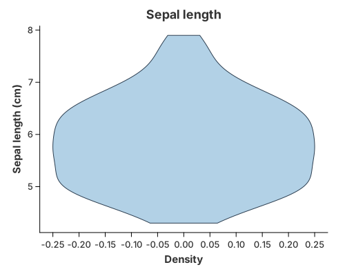
Read the value from y; the mark estimates its density and draws the symmetric
outline.
//! Violin plot — the convenience `mark_violin`.
//!
//! `mark_violin` is a **composite** mark: it expands into the ordinary public
//! recipe `transform_density` → `transform_band` → the shared polygon renderer.
//! For power users who want to build it themselves, `violin_manual.rs` writes the
//! same picture out of those primitives.
//!
//! The inputs come from the encodings:
//!
//! * `y` — the numeric value whose density is drawn (required);
//! * `x` — an optional category each violin sits on;
//! * `color` — an optional group that splits a category into lanes.

use charton::prelude::*;
use std::error::Error;

fn main() -> Result<(), Box<dyn Error>> {
    let iris = load_dataset("iris")?;

    chart!(iris)?
        .mark_violin()?
        .configure_violin(|violin| {
            violin
                .with_color("#7fb3d5")
                .with_opacity(0.6)
                .with_stroke("#2c3e50")
        })
        .encode(alt::y("sepal_length"))?
        .with_title("Sepal length")
        .with_x_label("Density")
        .with_y_label("Sepal length (cm)")
        .save("docs/src/images/violin.svg")?;

    println!("Saved docs/src/images/violin.svg");
    Ok(())
}
Grouped and faceted violins
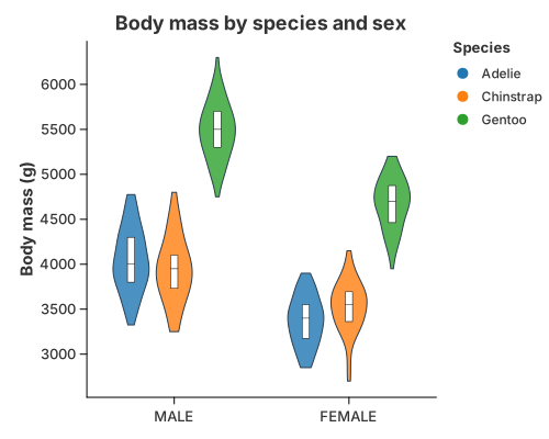
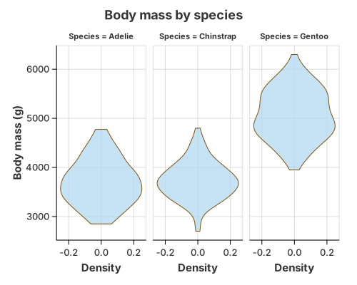
Two industry layouts, both one call to mark_violin plus the encodings:
- Faceted (Vega-Lite / Altair style): read only
yandfacetby the group, so each panel gets its own violin. - Dodged (ggplot2 style): map
xto the category andcolorto the group; the mark dodges the lanes side by side. The inner box is an ordinarytransform_quantile_boxlayer, drawn on top with.and(…).
//! Grouped violins — the two industrial layouts, with `mark_violin`.
//!
//! * **Faceted** (Vega-Lite / Altair style): one violin per panel.
//! * **Dodged** (ggplot2 style): the violins sit side by side inside each
//!   category, and an ordinary `transform_quantile_box` layer draws the inner
//!   box.
//!
//! The penguins `Sex` column has a couple of missing values. `Sex` is the
//! *positional* category here, so those rows are dropped, exactly as ggplot2 and
//! Altair would — no stray `null` violin appears, and the outline and its inner
//! box always agree because both use the shared lane layout.

use charton::prelude::*;
use std::error::Error;

fn main() -> Result<(), Box<dyn Error>> {
    let penguins = load_dataset("penguins")?;

    // === 1. Faceted: one violin per panel ==================================
    chart!(&penguins)?
        .mark_violin()?
        .configure_violin(|violin| violin.with_opacity(0.7).with_stroke("#7e5109"))
        .encode(alt::y("Body Mass (g)"))?
        .facet(FacetSpec::wrap("Species").with_columns(3))
        .with_title("Body mass by species")
        .with_x_label("Density")
        .with_y_label("Body mass (g)")
        .save("docs/src/images/faceted_violin.svg")?;

    // === 2. Dodged: side by side inside each Sex, with an inner box ========
    let outline = chart!(&penguins)?
        .mark_violin()?
        .configure_violin(|violin| violin.with_color("#d6eaf8").with_stroke("#2c3e50"))
        .encode((
            alt::x("Sex"),
            alt::y("Body Mass (g)"),
            alt::color("Species"),
        ))?;

    let inner_box = chart!(&penguins)?
        .transform_quantile_box(
            QuantileBoxTransform::new("Body Mass (g)")
                .with_category("Sex")
                .with_group("Species")
                .with_position(Position::dodge()),
        )?
        .mark_polygon()?
        .configure_geoshape(|mark| mark.with_fill("white").with_stroke("black"))
        .encode((
            alt::x("x").with_category_labels("Sex"),
            alt::y("y"),
            alt::path_group("path_group"),
        ))?;

    outline
        .and(inner_box)
        .with_title("Body mass by species and sex")
        .with_x_label("")
        .with_y_label("Body mass (g)")
        .save("docs/src/images/grouped_violin.svg")?;

    println!("Saved docs/src/images/faceted_violin.svg and grouped_violin.svg");
    Ok(())
}
When a category used for position is missing (the penguins Sex column has a
few), that row is dropped, exactly as ggplot2 and Altair would — no null violin
appears. A missing group (the colour/lane) behaves differently: it is kept as
a grey NA lane. See Missing Values & Gaps.
Split violin
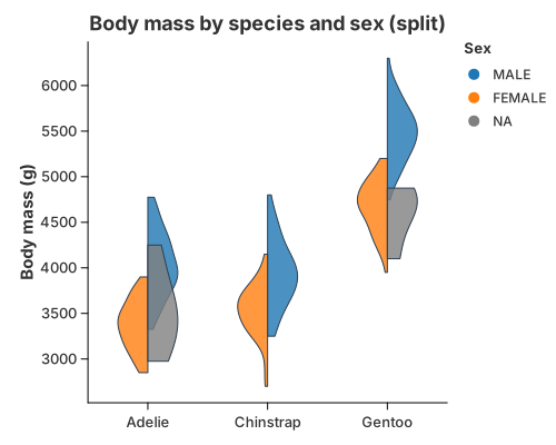
One centre line per category, the first group growing right and the second left:
mark_violin with configure_violin(…).with_split(true). Colour the result by
group and the two halves read as a single violin split down the middle.
//! Split violin — two groups as the left and right halves of one violin, with
//! `mark_violin`.
//!
//! Set `with_split(true)` and colour by the group: the first group grows to the
//! right of each centre and the second to the left. The mark expands this into
//! the ordinary density transform plus the general band geometry in `split`
//! mode, so each half is an ordinary polygon.

use charton::prelude::*;
use std::error::Error;

fn main() -> Result<(), Box<dyn Error>> {
    let penguins = load_dataset("penguins")?;

    chart!(&penguins)?
        .mark_violin()?
        .configure_violin(|violin| {
            violin
                .with_split(true)
                .with_color("#95a5a6")
                .with_stroke("#2c3e50")
        })
        .encode((
            alt::x("Species"),
            alt::y("Body Mass (g)"),
            alt::color("Sex"),
        ))?
        .with_title("Body mass by species and sex (split)")
        .with_x_label("")
        .with_y_label("Body mass (g)")
        .save("docs/src/images/split_violin.svg")?;

    println!("Saved docs/src/images/split_violin.svg");
    Ok(())
}
This is the general transform_band(…).with_split(true) geometry underneath: the
two groups share the centre line instead of sitting in separate lanes.
Raincloud
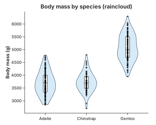
Three views of the same distribution, stacked with .and(…): the violin
outline, an inner inter-quartile box from transform_quantile_box, and every
observation as a jittered point layer.
//! Raincloud — a violin outline, an inner box and the raw observations.
//!
//! The raincloud is the clearest demonstration of the layer model: three views
//! of the same distribution, each an ordinary mark, stacked with `.and(…)`.
//!
//! * `mark_violin`              → the density outline
//! * `transform_quantile_box`   → the inter-quartile box and median
//! * `mark_point` + jitter      → every observation
//!
//! All three share the same x and y scales, so they line up automatically.

use charton::prelude::*;
use std::error::Error;

fn main() -> Result<(), Box<dyn Error>> {
    let penguins = load_dataset("penguins")?;

    // 1. The cloud: a density outline per species, straight from `mark_violin`.
    let violin = chart!(&penguins)?
        .mark_violin()?
        .configure_violin(|mark| {
            mark.with_color("#d6eaf8")
                .with_opacity(1.0)
                .with_stroke("#2c3e50")
                .with_stroke_width(1.0)
        })
        .encode((alt::x("Species"), alt::y("Body Mass (g)")))?;

    // 2. The box: the quartiles, drawn from the same raw observations.
    let inner_box = chart!(&penguins)?
        .transform_quantile_box(
            QuantileBoxTransform::new("Body Mass (g)").with_category("Species"),
        )?
        .mark_polygon()?
        .configure_geoshape(|mark| {
            mark.with_fill("white")
                .with_stroke("black")
                .with_stroke_width(1.0)
        })
        .encode((
            alt::x("x").with_category_labels("Species"),
            alt::y("y"),
            alt::path_group("path_group"),
        ))?;

    // 3. The rain: every observation, jittered inside the violin.
    let rain = chart!(&penguins)?
        .mark_point()?
        .configure_point(|point| {
            point
                .with_layout("jitter")
                .with_size(2.5)
                .with_opacity(0.55)
        })
        .encode((alt::x("Species"), alt::y("Body Mass (g)")))?;

    violin
        .and(inner_box)
        .and(rain)
        .with_title("Body mass by species (raincloud)")
        .with_x_label("")
        .with_y_label("Body mass (g)")
        .save("docs/src/images/raincloud.svg")?;

    println!("Saved docs/src/images/raincloud.svg");
    Ok(())
}
Tuning the violin
Shape options live in 1-D Density; these control the mark and its lanes:
| Method | Meaning |
|---|---|
configure_violin(…).with_bandwidth(BandwidthType::Silverman) | smoothing rule (Scott by default) |
.with_trim(true) | stop each curve at its own data range (the default for violins) |
.with_split(true) | draw two groups as one split violin |
.with_scale(BandScale::PerGroup) | every band has the same maximum width (default) |
.with_scale(BandScale::Global) | bands share one scale, so a denser group looks wider |
.with_scale(BandScale::Raw) | use the width column as it stands |
.with_width(0.5) | maximum width of a single band (matches the box plot) |
.with_side(BandSide::Right) | keep one bank of the violin (a half violin / ridgeline) |
.with_overlap(2.5) | grow each band past its lane so neighbours overlap |
.with_span(0.7) | total width of a category's group (matches the box plot and point marks) |
.with_color(…), .with_opacity(…), .with_stroke(…) | the outline's visual style |
Choosing a layout
| Variant | Use it when |
|---|---|
| Single violin | one distribution |
| Faceted | compare a few groups, each with room to breathe |
| Dodged | compare many groups within one category on a shared axis |
| Split | exactly two groups, to save horizontal space |
| Raincloud | the sample is small enough that showing every point matters |
How mark_violin is built
A dedicated mark makes the common case one line, while the grammar keeps the hard cases expressible. Because the mark expands into ordinary parts:
- the polygon renderer is shared with maps and custom shapes;
- new combinations are new layers, not new renderers;
- every rendering backend (SVG, PNG, PDF, GPU) already knows how to draw the parts.
Anything the mark does not expose is still reachable with transform_density,
transform_band / transform_quantile_box, and the basic marks.
Built from the primitives
The same picture without mark_violin: estimate the density, mirror it into a
polygon, then fill and outline it. It renders byte for byte like the mark above,
which is what makes mark_violin a name for this recipe rather than a second
implementation.
//! Violin plot — built by hand from the primitives.
//!
//! This is the same picture as `violin.rs`, written without `mark_violin` so the
//! composition is visible. It is the reference for anyone who wants to combine
//! the basic parts differently. A violin draws the *density* of a numeric column
//! as a symmetric outline, from three ordinary pieces:
//!
//! 1. `transform_density` estimates the density curve (the statistical part);
//! 2. `transform_band` mirrors it around the centre into a polygon;
//! 3. `mark_polygon` draws the closed, filled outline.
//!
//! Grouping is a separate concern: add `alt::x` for one violin per category,
//! `alt::color` to sit several side by side (dodged), or
//! `transform_band(…).with_split(true)` for a split violin. This is exactly what
//! `mark_violin` expands to, so the two render byte for byte identically.

use charton::prelude::*;
use std::error::Error;

fn main() -> Result<(), Box<dyn Error>> {
    let iris = load_dataset("iris")?;

    chart!(iris)?
        // 1. Estimate the density of sepal length. Trim to the observed range:
        //    a violin ends at the data, it does not fade into a thin tail.
        .transform_density(
            DensityTransform::new("sepal_length")
                .with_as("sepal_length", "density")
                .with_trim(true),
        )?
        // 2. Mirror the curve around the centre and emit a polygon.
        .transform_band(BandTransform::new("sepal_length", "density"))?
        // 3. Fill and outline the closed shape.
        .mark_polygon()?
        .configure_geoshape(|mark| {
            mark.with_fill("#7fb3d5")
                .with_opacity(0.6)
                .with_stroke("#2c3e50")
                .with_stroke_width(1.0)
        })
        .encode((
            alt::x("x"),
            alt::y("y").with_label("sepal_length"),
            alt::path_group("path_group"),
        ))?
        .with_title("Sepal length")
        .with_x_label("Density")
        .with_y_label("Sepal length (cm)")
        .save("target/example-output/violin_manual.svg")?;

    println!("Saved target/example-output/violin_manual.svg");
    Ok(())
}
See also
- 1-D Density — the KDE and its tuning (bandwidth, kernel, trim).
- Box Plots — the inner quantile box and the box-plot mark.
- Composing Your Own — recombining the primitives into new pictures the marks do not cover.
- Transforms & Columns — which columns each
transform reads and emits (
density,path_group,level, …). - Primitives:
transform_density,transform_band,transform_quantile_box,mark_polygon,mark_area— see Marks & Geometries.