Scatter
mark_point is the base point geometry: shape, size and colour are ordinary
channels, and a layout can spread overlapping observations.
Shape, size and a reference grid
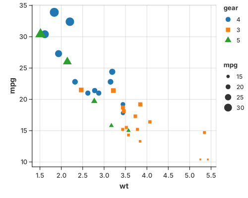
The grid is a theme feature (with_grid(true)), not a mark — turn it on for
any chart.
use charton::prelude::*;
use std::error::Error;

fn main() -> Result<(), Box<dyn Error>> {
    // Load the mtcars dataset
    let ds = load_dataset("mtcars")?;

    // Build a scatter plot
    Chart::build(ds)?
        .mark_point()?
        .configure_point(|p| p.with_size(30.0))
        .encode((
            alt::x("wt"),
            alt::y("mpg"),
            alt::color("gear").with_scale(Scale::Discrete),
            alt::shape("gear").with_scale(Scale::Discrete),
            alt::size("mpg"),
        ))?
        .with_grid(true)
        .save("docs/src/images/grid_line.svg")?;

    Ok(())
}
Point layouts
When points overlap — usually because one axis is categorical — a layout spreads them without changing their x position, so every observation stays visible:
- Jitter — small random offsets; good when you only need to break ties.
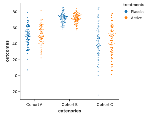
- Beeswarm — deterministic packing, so no two points overlap; best for small groups.
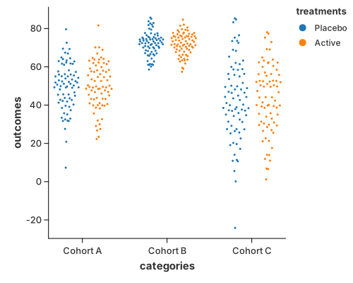
- Quasirandom — a low-discrepancy sequence that spreads points evenly and traces the outline of the distribution; best for large groups.
The layout is a property of the point mark:
#![allow(unused)]
fn main() {
.configure_point(|m| m.with_layout("beeswarm").with_size(1.5))
}
Separately from the layout, a color grouping dodges points into
side-by-side lanes — but only on a categorical x axis, where a lane means
something. On a continuous axis the points stay on their own x, so they line up
with a rule, line or area drawn through them. with_dodge(false) turns the lane
off even on a categorical axis, so the colour is an attribute rather than a
group (the dumbbell uses
it).
Beeswarm
use charton::prelude::*;

fn main() -> Result<(), Box<dyn std::error::Error>> {
    let mut categories = Vec::new();
    let mut outcomes = Vec::new();
    let mut treatments = Vec::new();

    let configs = [
        ("Cohort A", 45.0, 12.0),
        ("Cohort B", 70.0, 6.0),
        ("Cohort C", 35.0, 18.0),
    ];

    let treatment_types = ["Placebo", "Active"];

    // Use a simple deterministic counter to simulate "randomness"
    let mut seed: u32 = 42;

    for (label, mean, std_dev) in configs {
        for i in 0..150 {
            categories.push(label.to_string());

            // 1. Deterministic Pseudo-random using LCG
            seed = seed.wrapping_mul(1103515245).wrapping_add(12345);
            let raw_rand = (seed & 0x7FFFFFFF) as f64 / 2147483647.0;

            // 2. Simple Box-Muller transform to simulate Normal Distribution
            // This creates the "cluster" effect needed to show off Beeswarm
            let u1 = raw_rand;
            let u2 = ((i as f64 * 0.1).sin() + 1.0) / 2.0; // Another "random" seed
            let z0 = (-2.0 * u1.ln().max(-10.0)).sqrt() * (2.0 * std::f64::consts::PI * u2).cos();

            outcomes.push(mean + z0 * std_dev);

            // 3. Deterministic sub-group assignment
            let sub_idx = (i % 2) as usize;
            treatments.push(treatment_types[sub_idx].to_string());
        }
    }

    // 2. Render the Chart
    chart!(categories, outcomes, treatments)?
        .mark_point()?
        .configure_point(|m| m.with_layout("beeswarm").with_size(1.5))
        .encode((
            alt::x("categories"),
            alt::y("outcomes"),
            alt::color("treatments"),
        ))?
        .save("docs/src/images/beeswarm.svg")?;

    Ok(())
}
Quasirandom
use charton::prelude::*;

fn main() -> Result<(), Box<dyn std::error::Error>> {
    let mut categories = Vec::new();
    let mut outcomes = Vec::new();
    let mut treatments = Vec::new();

    let configs = [
        ("Cohort A", 45.0, 12.0),
        ("Cohort B", 70.0, 6.0),
        ("Cohort C", 35.0, 18.0),
    ];

    let treatment_types = ["Placebo", "Active"];

    // Deterministic counter used to build a repeatable normal sample.
    let mut seed: u32 = 42;

    for (label, mean, std_dev) in configs {
        for i in 0..150 {
            categories.push(label.to_string());

            seed = seed.wrapping_mul(1103515245).wrapping_add(12345);
            let raw_rand = (seed & 0x7FFFFFFF) as f64 / 2147483647.0;

            let u1 = raw_rand;
            let u2 = ((i as f64 * 0.1).sin() + 1.0) / 2.0;
            let z0 = (-2.0 * u1.ln().max(-10.0)).sqrt() * (2.0 * std::f64::consts::PI * u2).cos();

            outcomes.push(mean + z0 * std_dev);

            let sub_idx = (i % 2) as usize;
            treatments.push(treatment_types[sub_idx].to_string());
        }
    }

    // The default method spreads the cloud with a low discrepancy sequence,
    // which gives the smooth violin outline.
    chart!(categories, outcomes, treatments)?
        .mark_point()?
        .configure_point(|m| m.with_layout("quasirandom").with_size(1.5))
        .encode((
            alt::x("categories"),
            alt::y("outcomes"),
            alt::color("treatments"),
        ))?
        .save("docs/src/images/quasirandom.svg")?;

    // The pseudorandom method keeps the density scaling but pairs the points
    // with a random-like sequence, so the outline is noisier.
    chart!(categories, outcomes, treatments)?
        .mark_point()?
        .configure_point(|m| {
            m.with_layout("quasirandom")
                .with_quasirandom_method("pseudorandom")
                .with_size(1.5)
        })
        .encode((
            alt::x("categories"),
            alt::y("outcomes"),
            alt::color("treatments"),
        ))?
        .save("target/example-output/quasirandom_pseudorandom.svg")?;

    Ok(())
}
The quasirandom pairing can be changed with
with_quasirandom_method("pseudorandom").
A strip / rug plot is the same idea with mark_tick instead of mark_point:
see Strip & Rug Plots.
See also
- Marks & Geometries — the point mark and its layouts.
- Histogram and 1-D Density — the summarised views of the same observations.